Past Event: Data Physicalization Workshop — June 27th
Saturday, Jun 27 · 10:00 AM to 12:00 PM CDT
The Coffee Shop NE
2852 Johnson St NE · Minneapolis, MN
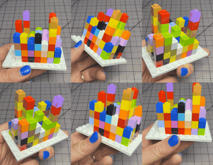
What if your next chart wasn't on a screen?
Join tcplot for a hands-on morning of data physicalization — translating real datasets into objects you can hold, turn over, and put on your desk. We'll explore paper, thread, beads, and the surprisingly hard question of what to encode when you can't reach for a library.
We'll draw inspiration from projects like Giorgia Lupi and Stefanie Posavec's Dear Data, Nathalie Miebach's weather sculptures, and the broader tradition of data physicalization (dataphys.org). The constraint is the point: when you can't pipe data into ggplot, you have to make real decisions about hierarchy, encoding, and what's actually worth showing.
What you'll do
- ▸ Pick from a handful of small, pre-prepared datasets (Twin Cities weather, MN bird sightings, library checkouts, a week of your own personal data, or any other data)
- ▸ Work solo or in pairs to translate it into a physical artifact
- ▸ Share what you made and what surprised you
- ▸ Leave with the object you built
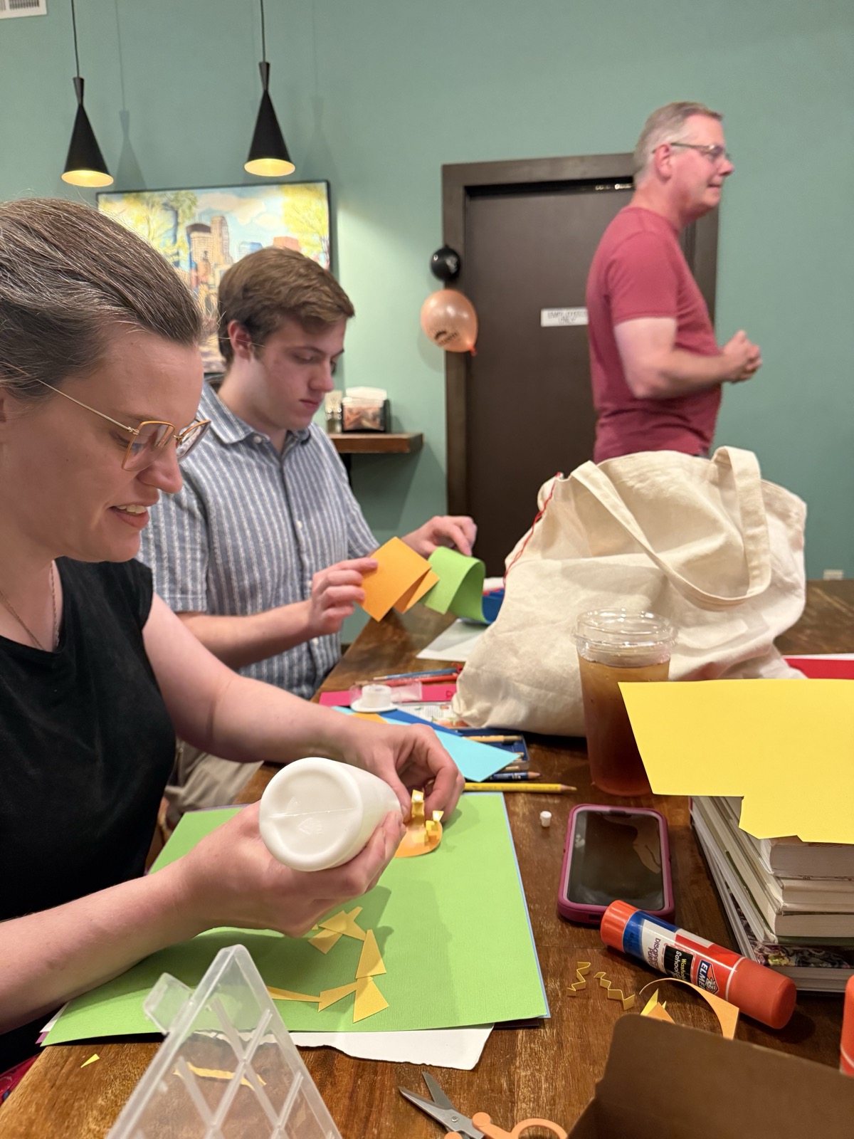
From the event — building data out of paper, glue, and scissors.
How the two hours will flow
A loose schedule — we'll bend it to the room. The point is that you walk in with a dataset and walk out with an object.
- ▸ Welcome & warm-up. Coffee, quick intros, and a gallery walk through real examples — Dear Data postcards, Miebach's weather sculptures.
- ▸ Icebreaker. Everyone picks a project from dataphys.org, spends a few minutes with it, then explains it to the group: what's the data, how is it encoded, and what makes it work? A quick way to meet each other and warm up the eye.
- ▸ Encoding without a library. A short crash course in the physical vocabulary of data. On a screen you reach for x, y, color, and size — in your hands you have far more to work with: length (a strand of thread, a torn strip of paper), count (how many beads on a string), position and order (near/far, stacked, sequenced), color and texture (smooth vs. rough, matte vs. shiny), weight, height, and even negative space (the gaps that say as much as the marks). We'll talk about which channels the hand and eye read most easily, when an encoding is honest versus merely pretty, and the trade-off at the center of all of this: you can only encode a few variables before an object stops being legible, so choosing what to leave out is the real craft. Then I'll turn a single row of data into an object live — narrating each choice — so you can see the decisions in real time before you make your own.
- ▸ Pick & sketch. Choose your dataset, name the one question you want it to answer, and rough out your encoding on paper before you touch the beads.
- ▸ Make. The heart of it — build your artifact, solo or in pairs. I'll circulate with prompts when you get stuck and more supplies when you get ambitious.
- ▸ Show & tell. Pass your object around the table. Tell us what you encoded, what you had to leave out, and what surprised you when the data became something you could hold.
- ▸ Wrap. A group photo of everything we made, a few pointers for going further, and you take your object home.
Datasets to choose from
These are real, ready to use, and small enough to build in two hours. They range in complexity — start simple or take on something with more to juggle.
Twin Cities weather — this week
The actual forecast for Minneapolis, the week starting Sunday. Five days, several variables — a good medium-complexity pick.
| Day | High °F | Low °F | Rain chance | Conditions |
|---|---|---|---|---|
| Sun, Jun 28 | 89 | 76 | 57% | Showers & thunderstorms likely |
| Mon, Jun 29 | 97 | 76 | 12% | Sunny |
| Tue, Jun 30 | 95 | 72 | 40% | Chance of storms |
| Wed, Jul 1 | 94 | 73 | 33% | Chance of storms |
| Thu, Jul 2 | 94 | 73 | 47% | Chance of storms |
National Weather Service. (2026). Point forecast for Minneapolis, MN (44.98°N, 93.27°W) [Data set]. National Oceanic and Atmospheric Administration. Retrieved June 26, 2026, from https://api.weather.gov/gridpoints/MPX/108,72/forecast. The published forecast reaches Thursday; the weekend isn't out yet.
Minnesota bird sightings — spring
The most-reported birds across Minnesota this May and June. One category, one number — the simplest place to start.
| Species | Observations |
|---|---|
| Red-winged Blackbird | 319 |
| Mallard | 284 |
| American Robin | 283 |
| Canada Goose | 235 |
| Baltimore Oriole | 194 |
| Yellow-rumped Warbler | 192 |
| Rose-breasted Grosbeak | 177 |
| Wild Turkey | 153 |
| Song Sparrow | 142 |
| American Goldfinch | 132 |
GBIF.org. (2026). Occurrence search: Aves (birds), Minnesota, United States, May–June 2026 [Data set]. Global Biodiversity Information Facility. Retrieved June 26, 2026, from https://www.gbif.org/occurrence/search. Counts are the number of recorded observations.
The planets — by the numbers
The eight planets (plus Pluto), with four properties chosen because they map so naturally onto things you can make: size, weight, force, and position. A natural fit for a hanging mobile or a beaded model of the solar system.
| Planet | Diameter (km) | Mass (10²⁴ kg) | Gravity (m/s²) | Dist. from Sun (10⁶ km) | Surface temp (°C) |
|---|---|---|---|---|---|
| Mercury | 4879 | 0.330 | 3.7 | 57.9 | 167 (333 °F) |
| Venus | 12104 | 4.87 | 8.9 | 108.2 | 464 (867 °F) |
| Earth | 12756 | 5.97 | 9.8 | 149.6 | 15 (59 °F) |
| Mars | 6792 | 0.642 | 3.7 | 227.9 | −65 (−85 °F) |
| Jupiter | 142984 | 1898 | 23.1 | 778.6 | −110 (−166 °F) |
| Saturn | 120536 | 568 | 9.0 | 1433.5 | −140 (−220 °F) |
| Uranus | 51118 | 86.8 | 8.7 | 2872.5 | −195 (−319 °F) |
| Neptune | 49528 | 102 | 11.0 | 4495.1 | −200 (−328 °F) |
| Pluto | 2370 | 0.0146 | 0.7 | 5906.4 | −225 (−375 °F) |
Williams, D. R. (2024). Planetary fact sheet [Data set]. NASA Goddard Space Flight Center, National Space Science Data Center. Retrieved June 26, 2026, from https://nssdc.gsfc.nasa.gov/planetary/factsheet/. Negative rotation periods indicate retrograde spin.
Your own steps — from your phone
Open the health app on your phone (Apple Health, Google Fit, Fitbit, whatever you carry) and read off the miles you walked each day this past week. Seven numbers, completely your own — ideal for a bracelet or a small loom.
Library checkouts — bring your own
For a more complex challenge, pull a live slice of Twin Cities library data from Minneapolis Open Data — checkouts by branch, item, or month carry several variables at once, so you'll have to decide what to keep and what to drop.
City of Minneapolis. (n.d.). Minneapolis Open Data [Data portal]. Retrieved June 26, 2026, from https://opendata.minneapolismn.gov/.
More fun datasets to download
Want something different? These are free CSVs, small enough to encode by hand. The big ones — just grab a handful of rows or a single season.
- ▸ Bob Ross paintings — the exact paint colors used in every episode of The Joy of Painting. A bead per color is almost too perfect; pick one season.
- ▸ Palmer Penguins — bill, flipper, and body size for three Antarctic penguin species. Map a strip of paper to each flipper length; grab a handful of rows.
- ▸ mtcars — 32 classic cars by horsepower, weight, and fuel economy. A tidy, all-numeric set that bars and beads love.
- ▸ Hair & eye color — counts of people by hair and eye color. A natural fit when the encoding is literally the color.
- ▸ Anscombe's quartet — four tiny datasets with identical statistics but wildly different shapes. Build all four and feel the difference.
What we'll provide
Cardstock, embroidery thread, beads, tape, markers, making supplies, datasets ready to go.
Ideas to get you started
Not sure where to begin? Here are a few forms that translate data especially well — but treat them as springboards, not instructions.
- ▸ Wire-and-bead jewelry. Thread a bracelet or necklace where each bead is a day, a row, or an event — color for category, size for magnitude, spacing for the gaps in between. You leave wearing your data.
- ▸ Altoid-tin looms. Notch the lip of a tin, string a warp across it, and weave: let the colors of the weft rows encode one variable and the bands of the warp another. A whole woven dataset that snaps shut in your pocket.
- ▸ Layered paper topography. Cut and stack cardstock contours so a value over time rises into a little 3D landscape — peaks for the highs, valleys for the lows, something you read with your fingertips.
- ▸ Hanging mobiles. Suspend tagged elements from thread and let the piece find its own balance — arm length and height encode the numbers while gravity does the comparing for you.
- ▸ Punch-card strips. Punch holes into a ribbon of cardstock, player-piano style — present or absent, more or fewer — so a week of yes/no data becomes a strip you can run through your hands.
What to bring
Yourself. Optionally, a week of personal data you've been tracking (sleep, coffee, steps, moods, anything) or your own craft supplies of choice.
Who this is for
Anyone curious about data visualization — practitioners working in D3, Tableau, ggplot2, Observable, or none of the above. No craft skills required.
Hope to see you there!
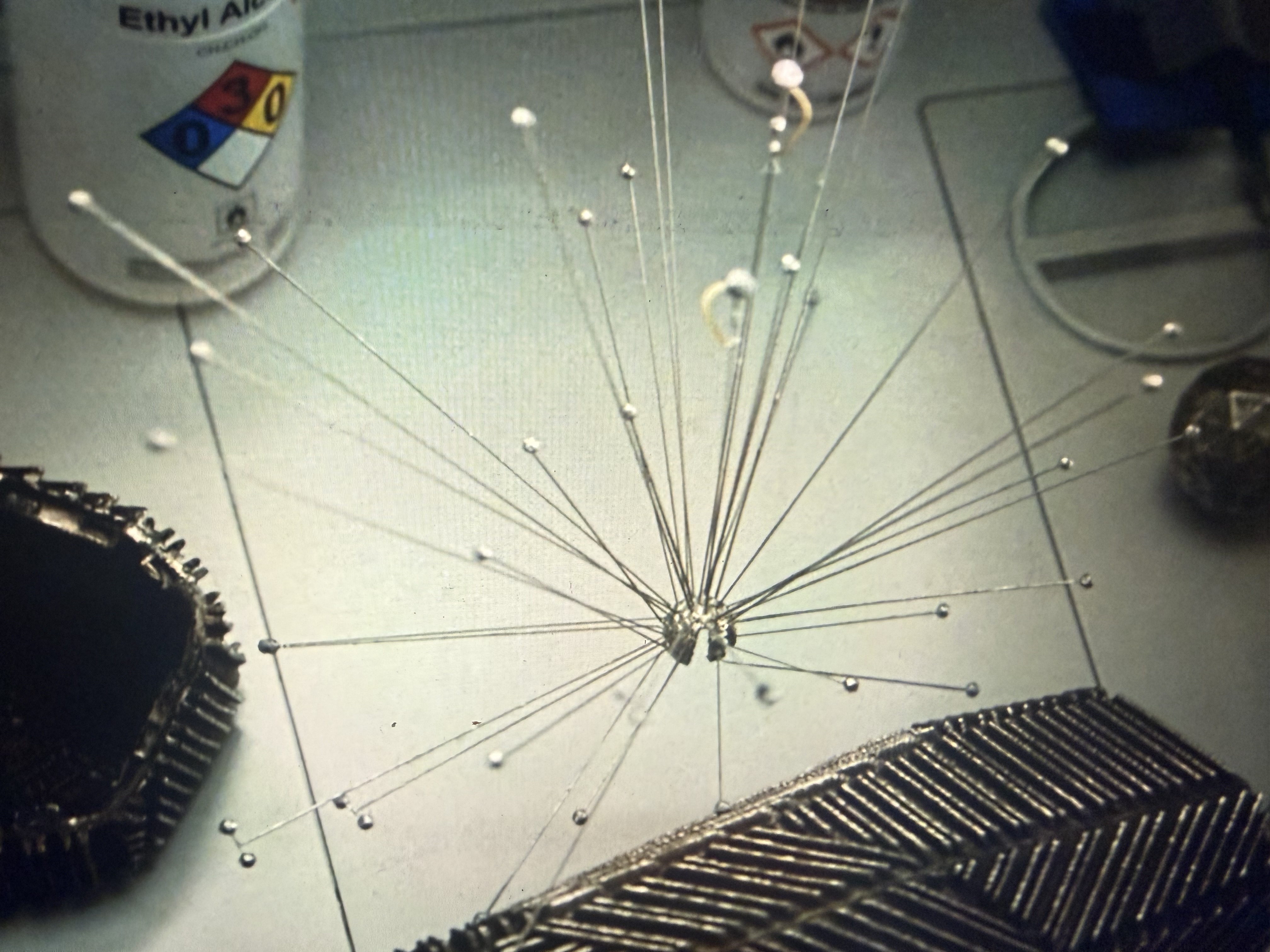
Still from Project Hail Mary. Dir. Phil Lord and Christopher Miller. Metro-Goldwyn-Mayer, 2026.
Books on the table
A small library will be out for you to flip through whenever you need a spark, a reference, or a reason to step back from the glue.
- Observe, Collect, Draw! — Giorgia Lupi & Stefanie Posavec. A guided journal that turns the Dear Data method into a workbook: track your own life and hand-draw it. Why it's here: the fastest on-ramp to encoding personal data by hand — exactly what you'll be doing today.
- Dear Data — Giorgia Lupi & Stefanie Posavec. A year of weekly postcards in which two designers mailed each other hand-drawn visualizations of their everyday lives. Why it's here: the founding text for slow, analog, deeply personal data — proof that a chart can be made entirely by hand and be the better for it.
- Speak Data — Giorgia Lupi & Phillip Cox. Conversations with artists, scientists, thinkers, and dreamers about how we live our lives in numbers, grounded in Lupi's idea of Data Humanism. Why it's here: it reframes data as something human and felt rather than purely technical — the mindset behind making data you can hold.
- Code as Creative Medium — Golan Levin & Tega Brain. A handbook of exercises and assignments for teaching and learning creative coding and generative art. Why it's here: a deep well of generative, constraint-led prompts — many translate straight from screen to scissors and thread.
- Beautiful Evidence — Edward Tufte. On how evidence becomes argument: sparklines, mapped pictures, and the integrity of showing data honestly. Why it's here: the discipline of encoding truthfully — a useful conscience when you're tempted to choose pretty over honest.
- Envisioning Information — Edward Tufte. A classic on escaping flatland: layering, small multiples, and packing many dimensions into a clear image. Why it's here: physical objects are inherently multi-dimensional, and this is the master class in managing that density without losing the reader.
- The Book of Circles — Manuel Lima. A visual history of circular information design, from ancient diagrams to modern network graphics. Why it's here: a catalog of non-rectangular layouts to steal from when a grid feels too obvious for your object.
- Nightingale, Issues 1–3 — the Data Visualization Society. The society's print journal, full of essays, interviews, and showcase work from across the dataviz field. Why it's here: a snapshot of where the field is right now — community, debates, and plenty of fresh visual inspiration.
- Value and Transformation of Corals — Christine & Margaret Wertheim. The catalog of the Crochet Coral Reef, a global craftivist project translating marine ecology — and hyperbolic geometry — into crocheted yarn. Why it's here: the most ambitious example of data and science made physical by hand, at the scale of a movement — proof of how far this practice can go.